Any serious trader with years of experience in the game will tell you why TradingView is arguably the best charting platform on the planet.
The browser-based software was launched in 2011 and has consistently been revered for highly intuitive and aesthetically-pleasing charting functionalities across several popular financial markets like forex, stocks, indices, futures, and cryptocurrencies.
In this article, we’ll cover the best 5 of these indicators exclusive to TradingView, how they work, and which aspect of your trading they can enhance (these will not be ranked in any particular order of importance).
1. Volume Profile Visible Range (VPVR)
Best for: traders who understand and trade volume-based strategies
Virtually all free default volume indicators show this element as bars at the bottom of the chart to indicate volume per candle. However, the Volume Profile Visible Range (VPVR) is distinct in that it appears on the right-hand side as it shows volume at specific price levels.
The horizontal display is more significant as it shows past ‘hotspot’ areas that may be relevant again in the future. These can guide you on the key support and resistance levels to use when trading. Below is a chart with the VPVR on it (image 1).
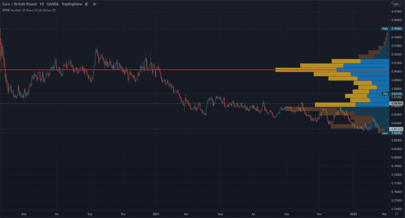
The red line shows that the most volume occurred at that particular price level. Thus, a trader may look to only consider opportunities when the price reaches this point in the expectation of a big move.
However, this is the only tool on this list that needs a paid subscription with TradingView. Generally, volume profile usually doesn’t come for free with many other platforms on the market, but it’s a big deal for traders using volume-based techniques when trading.
2. Williams VIX Fix Bollinger Bands
Best for: trading tops and bottoms or turning points
This indicator was first introduced in the mid-2000s by Larry Williams, who initially took the idea from the VIX or volatility index created by the Chicago Board Options Exchange in 1993.
The VIX Fix on TradingView consists of a 20-day Moving Average (which is adjustable) and histogram bars. It extrapolates how near price has closed to the highs and lows over this period.
The main element of this indicator is the green bars which essentially show how greedy or fearful traders are. When you see rising bars in a downtrend, it suggests fear in the markets, meaning a potential new uptrend may be on the cards.
In an uptrend, this translates to greed, indicating a potential sell-off. Of course, as with nearly all indicators, this is a lagging tool. Therefore, you should use it with other confirmation factors.
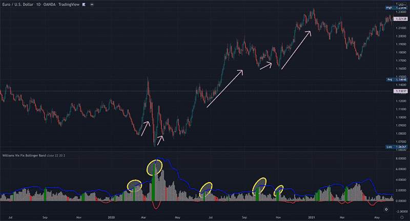
However, in the EURUSD daily chart above, we’ve detailed what happens when you see rising green bars (Image 2).
3. Support and resistance by Patternsmart indicator
Best for: identifying swing highs/lows
It’s worth noting that this indicator on TradingView is available in different versions from various developers. We’ve selected the ‘Patternsmart’ version as it is one of the best ones.
However, the concept is similar across other swing high/low indicators. This tool automatically plots dotted lines representing a particular market’s swing highs and lows on each time frame.
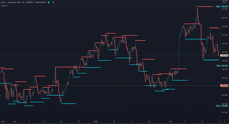
Here is how it looks on the 4HR chart of EURJPY (Image 3).
How is this information helpful, you may ask? Well, every trader is interested in knowing when a retracement has come to an end before the price moves in a new or prior direction.
One of the subtle clues to know this is through swing highs and lows and, more importantly, identifying the significant ones based on candle structure. Aside from retracements, this information can also show you key support and resistance levels or turning points.
It’s crucial to understand that you should only use this indicator observationally and not necessarily as a trigger to go long or short. After all, it is a lagging tool and, therefore, not consistently accurate.
4. Volatility stop
Best for: moving your stops to secure gains
The volatility stop is quite similar to the previously mentioned tool. It also shows swing highs and lows. Yet, it is explicitly used to offer you areas to move your stops once in a profitable position.
The indicator is based on calculations from the Average True Range (a volatility-based indicator) and an Exponential Moving Average to present a volatility-adjusted picture of the present trend using dots.
Volatility stop allows traders to keep their stop a bit closer to price than other methods (e.g., Fib retracements, traditional swing highs/lows, etc.) but not too close that it doesn’t offer any ‘breathing room.’
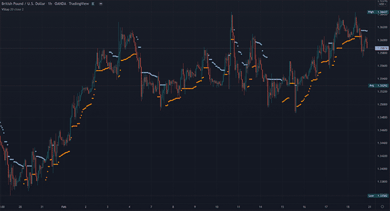
This results in more profits when the market does eventually ‘kick’ you out of your trades. Below is an example of the tool on TradingView (Image 4).
5. Heiken Ashi charts
Best for: staying in trends for long through a noise-filtering chart
Although the Heiken Ashi chart is not unique to TradingView, the advantage is you don’t need to download any software (since TradingView is primarily browser-based). Heiken Ashi looks very similar to conventional Japanese candlesticks.
However, Heiken Ashi is calculated differently to show price action in a much ‘smoother’ way. Heiken Ashi means ‘average bar’ in Japanese, and therefore, this chart presents prices as averages without being as detailed.
This makes trends much easier to spot because you’re dealing with less ‘noise.’ The primary usage for the Heiken Ashi is staying in trending markets for long by observing the colors of the candles.
Generally, in a strong uptrend, the Heiken Ashi will continue to show green colors where the ordinary Japanese candles present different confusing candle formations.
In the example below, we’ve placed the Heiken Ashi above a regular Japanese candlestick chart (figure 5) and put a purple rectangle on the part showing this scenario.
This illustration should demonstrate the subtle but significant differences in smoothness between the two.
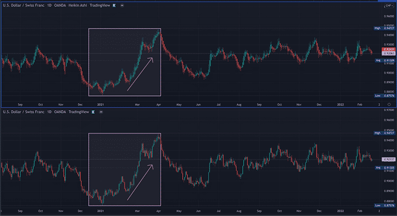
A trader would remain in a position and take profits once the color changed to red, allowing them to ‘ride the wave’ for much longer than they would ordinarily.
Final thoughts
Anyone who has used MT4 to trade primarily currencies and a few other instruments would immediately notice a massive ‘worlds apart’ difference when using TradingView.
Aside from the impressive range of features and incredible user interface, a platform like TradingView boasts thousands of traders or developers who create unique tools that you don’t find with most other charting packages.
Therefore, this list only scratches the surface regarding beneficial indicators on this platform.