
Introduction
The strengths and weaknesses of the market are determined by the trader’s analysis of the trend in prices. A strong market gives a good buying opportunity for traders while a weak market is where you should sell the asset or forex.
In essence, a strong market will go up or gain while in a weak market the price action will move down. Trading indicators and techniques are essential in understanding how to spot the momentum of a stock or forex so that you know how to trade. The market analysis applies both in swing and day trading.
However, the most important aspect is that you can analyze the strength/ weakness of the market just by looking at the trading chart and the price action. This option is contrasted with having to look at the fundamental news and analysis trending in the market.
Trading chart analysis
1. Reading Candles
The green/blue and red candles appear based on the closing and opening prices of the currencies (if we are trading forex). The green candles appear if the closing price of the stock or forex is higher than the opening price. The red candle appears if the closing price is lower than the opening price.
More red candles indicate that the closing prices are lower than the opening prices — leading to a weakening market. An increase in green candles shows the market is strengthening. Traders should buy when there are green candles that are increasing and sell when the red candles are gaining momentum.
The market can alternate between red and green especially in a sideways market. Let’s look at an example of a swing trader that intends to observe the market trend for several months in a forex market.
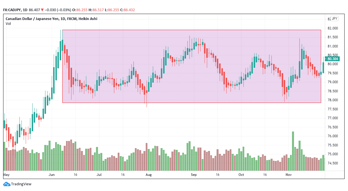
Figure 1: CAD/JPY market strength analysis
Figure 1 shows a candle diagram of the CAD/JPY pair where the red and blue bars alternate. This diagram is an example of a swing trade taking place up to 5 months. Most traders don’t have the patience to wait for such a long time to trade. However, it is necessary to examine the market trend to know the predisposed direction of the trade.
Red candles were longer and more at the beginning of June 2020 as compared to green candles. After July 2020, the red candles lost momentum while the blue candles continued to increase in length and numbers. While this chart shows daily trading, the market was able to sustain a particular direction over a long period as opposed to alternating daily trends.
We will wait to see which candle breaks the box barrier and then we will identify the market direction. If it breaks below, then the forex pair is getting weaker. But if the breakout is above, then the forex pair will be getting stronger.
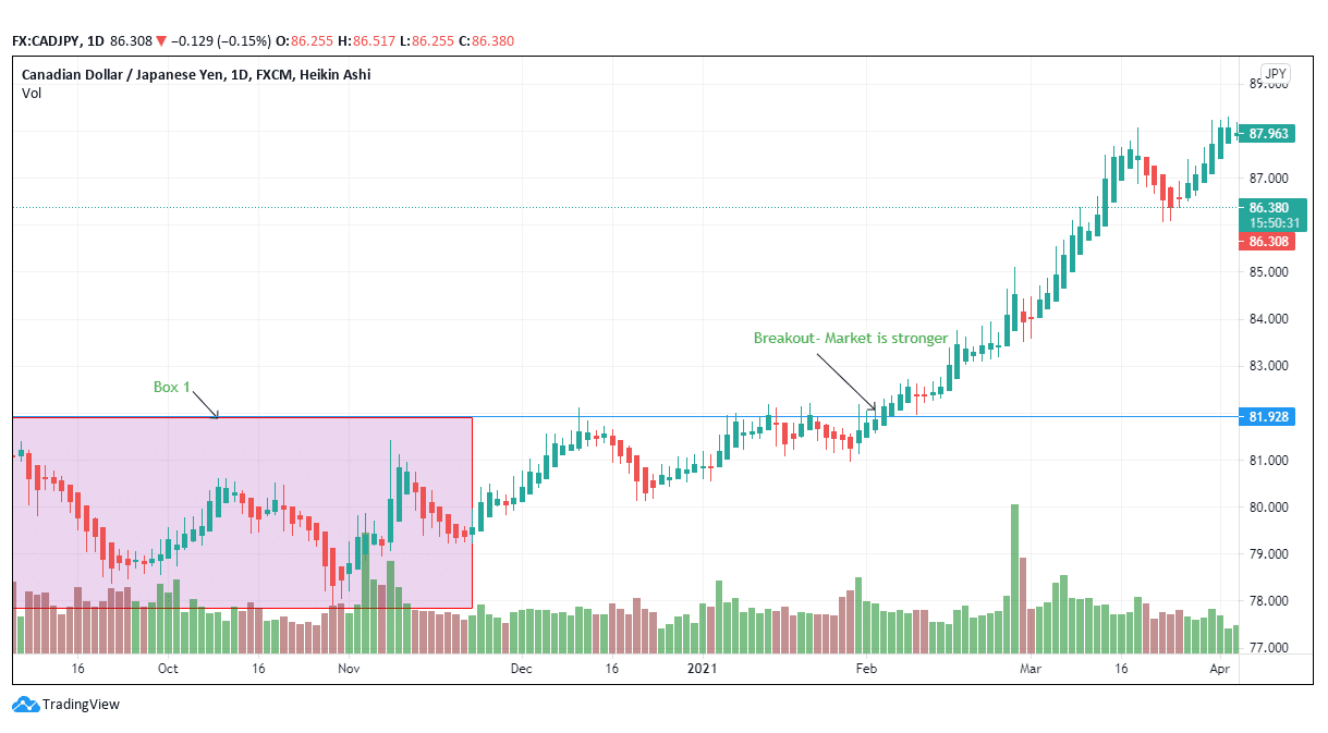
Figure 2: Market gains strength and CAD/JPY pair rises
Figure 2, shows a potential uptrend and the market is gaining strength. The breakout occurs at 81.928 and the trader should not stay on the sidelines at this point. The buy option is applicable at this point.
The upward breakout is visible since the price finally crosses the rectangular box drawn after five months. The CAD/JPY pair rises 7.37% to 87.963 from 81.928. The box gives the trader a cushion or a demarcation between a down and an up-movement. You can continue increasing the length of the box until the strength or weakness of the market is visibly defined. The market is strong if it moves above the box. It is weak if it goes below the box.
2. Relative strength indicator (RSI)
RSI looks at the value of a stock or forex pair relative to the past value i.e., it confirms if there is growth or decline. The RSI is calculated over 14 days (2 weeks). Traders identify two signals with the RSI: overbought and oversold. The other signal that may arise is termed divergence.
Overbought shows that the stock’s value has increased rapidly over a short time and may soon revert lower. Oversold shows that the stock’s value has decreased rapidly over a short time and may move higher. In today’s trading platforms, the RSI is in-built in the system and it can be found as an add-on indicator.
An RSI of 30 shows the forex pair has been oversold while an RSI figure of 70 and above shows that the stock is overbought and is about to fall in the weak zone.
Divergence shows whether the forex pair’s price movement contrasts the forex momentum over the 14 days. If the RSI is bullish and the price is bearish, the trader may want to prepare for a tightening market rather than a weak or a bearish trend.
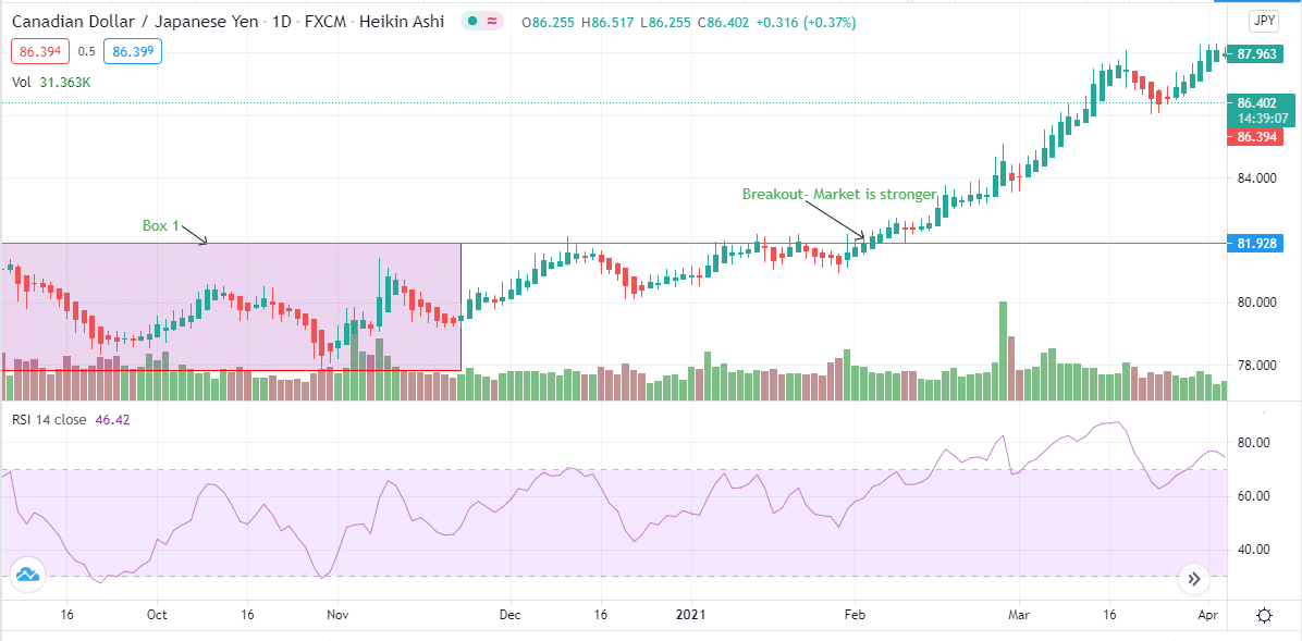
Figure 3: RSI on the CAD/JPY pair
As of April 22, 2021, the RSI of this trading pair was 46.42. This figure shows a neutral point as the currency’s strength is waning and the market is becoming weak. But if you move to the region close to the breakout point (February 2, 2021), the RSI was 59.40.
On February 25, 2021, the RSI hit a high of 82.83 just before it encountered a short retracement and lowered to 69.05 on March 1, 2021. It had moved slightly below 70, thereby the forex pair regained the uptrend and hit a high of 84 on March 18, 2021. The market fundamentals are in favor of the Canadian dollar as opposed to the Japanese yen.
As you focus on the RSI also consider other factors such as economic news, supporting fundamentals, and volume as they affect the movement/ strength of the market.
Conclusion
In this article, we have focused on tapping into the strength/ weakness of the market in determining the entry or exit points in a trade. Traders need to understand how to interpret candles and indicators as they hold the key to successful trading even for beginners.