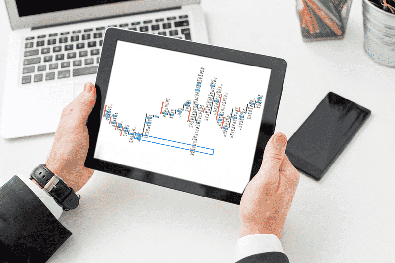
Footprint charts are a sort of more detailed candlestick chart. In addition to price, they provide information such as the volume traded at each price and the aggression of buyers and sellers in the market at each price level. As with traditional candlestick charts, footprint charts allow for adjustment of time-frames so that you can perform short-term, intermediate, or long-term analysis.
How do they work?
In essence, footprint charts give us an inside look into the market. They show where the buyers and sellers are, where they are trapped, and where we can anticipate a breakout from a trend. A candlestick chart only shows four prices: high, low, open, and close.
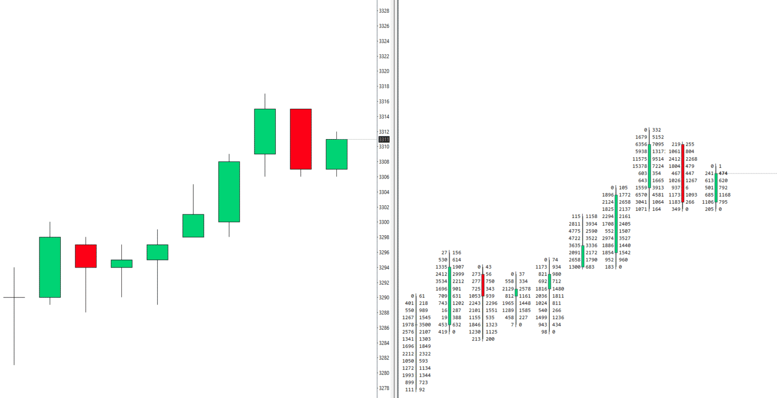
A footprint chart, on the other hand, shows the volume bought and sold at each price level within a candlestick. Let’s look at a pictorial comparison of the two in the chart above.
Classification of footprint charts
We shall look at three common types of these charts, namely the bid/ask delta and volume footprint charts.
1. Bid/Ask footprint chart
This is the most commonly used footprint chart. It shows the number of trades executed on the bid price against the number of trades executed at the asking price. In other words, it shows the number of orders made by sellers against those made by buyers at the same price level. As the bid and ask prices change, so makes the bid/ask footprint.
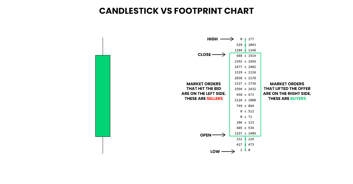
In the example above, on the left side of the chart, you can see the bears who sold at the bid price. On the right side are the bulls who bought at the ask price, subsequently driving it higher.
2. Delta footprint charts
A delta footprint chart shows only one number, which is the difference between buyer trades and seller trades. It makes it easier to observe aggression at each price point, as it points out the winner of the battle using color codes. As in normal candlesticks, green represents the buyers or bulls, while a red represents the selling bears.
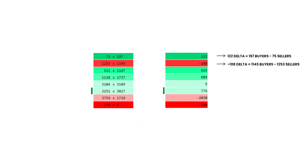
In the chart above, from the top, you can see there were 197 buyers against 75 sellers at the highest price, whose difference yielded a score of 122 delta. The delta bar is green, showing the bulls had the upper hand. At the second-highest price, there were 1145 buyers against 1253 sellers, yielding a negative difference score of -108 delta. The delta bar is red, showing the bears dominated at that price point.
3. Volume footprint charts
Unlike the delta type, the volume footprint chart does not show negative or positive numbers. It simply sums the number of trades completed at each price point, in spite of whether they are bids or asks. For instance, let’s say you have a bid/ask footprint showing 300*900. Whereas the delta would give you a 600 reading, a volume footprint will simply read 1200.
How useful is the volume footprint? Well, for one, they show the price at which there was interest from both bulls and bears. Using volume footprints, you can see where large market participants such as hedge funds and banks are comfortable trading. They also help in recognizing breakouts based on high volume, which you can then reuse as future supports and resistances.
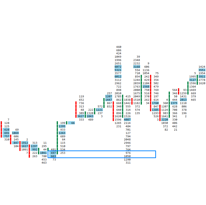
In the chart above, you can see the high-volume area was re-used as a future support level.
Trading strategies using footprint charts
There are several situations you can look for using these charts that will generate buy or sell signals.
1. Imbalance between buyers and sellers
This is where buyers dominate the sellers or sellers dominate the buyers. Usually, this balance is computed diagonally as below.
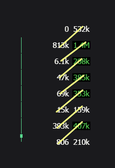
Usually, there’ll be a lot of imbalances on a normal day of trading. However, if you identify three or more consecutive imbalances, it can indicate an apparent buyer or seller strength. Such a level can form future supports or resistances because the large buyers or sellers will want to hold those prices.
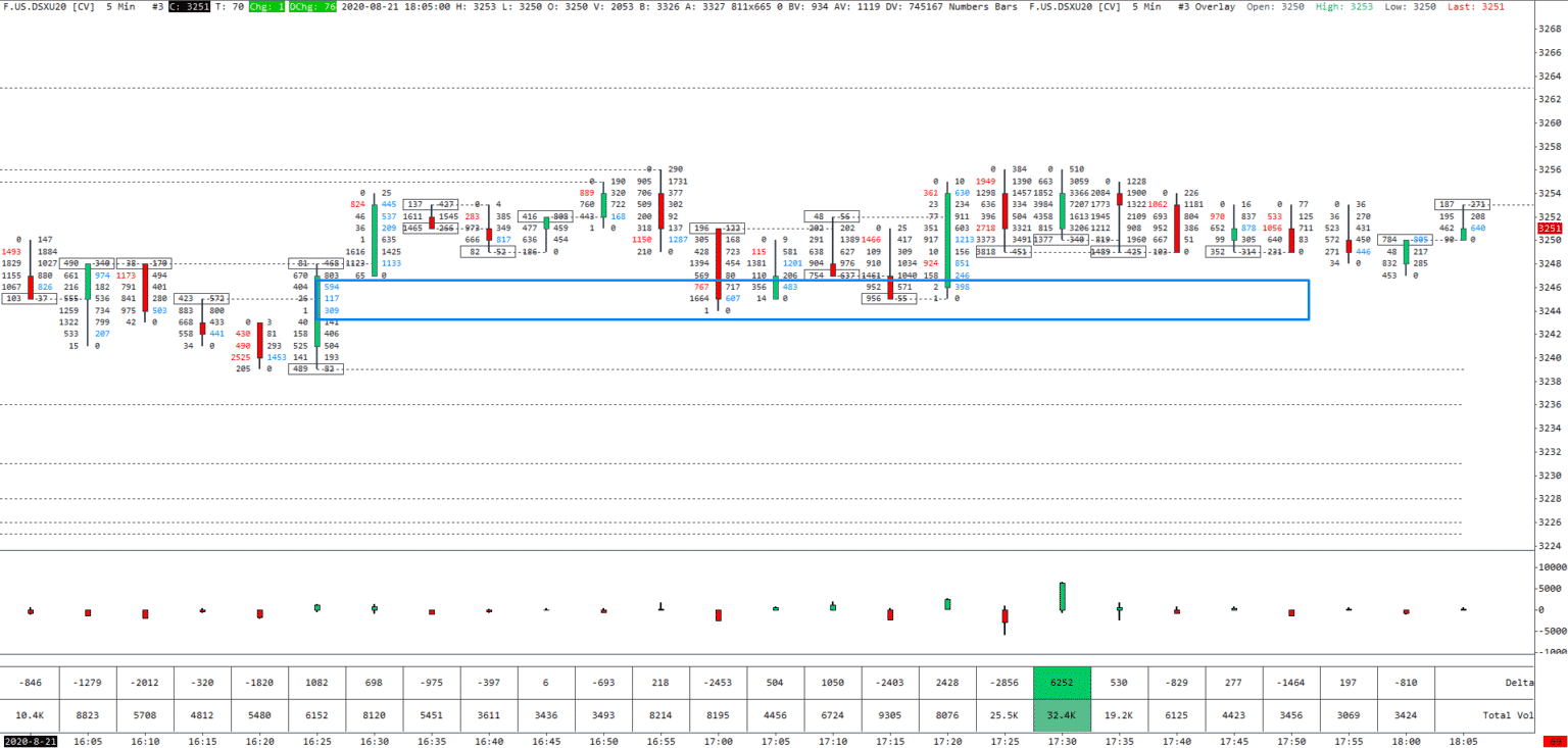
In the chart above, you can see the buyers dominated the sellers for three consecutive price levels, which went on to provide a future support level.
2. Identifying a finished or unfinished auction
Ideally, prices go up as demand increases until there is no more demand for the asset being traded. Alternatively, prices go down with increased supply until no more sellers are willing to sell. A finished auction happens when a candlestick represented by a bid/ask footprint chart shows a zero bids at the highs or zero asks at the lows. Such an auction signifies that there are no bid trades at the candle’s high or no ask trades at the candle’s low.
If the candle still buys and sells at its extreme levels, that represents an unfinished auction. Such an auction could be a sign that the price will likely come back to this level in the near future.
3. Volume imbalance
Using volume footprint charts, you can easily tell where the most volume was traded. Typically, in a bullish market, the most volume should be at the top of the candlesticks. Here, a volume imbalance will occur when the candle closes at a low volume, indicating a bearish reversal in the works. Conversely, for a bear market, the most volume should be at the bottom. An imbalance, in this case, occurs when the candlestick closes with smaller volumes at the bottom, indicating an imminent bullish reversal.
Key takeaways
Footprint charts are essentially candlestick charts that provide more detail. They are especially useful in seeing the effect of supply and demand forces on the market, and as such, can be used to predict price movements. Combined with other indicators, these charts can be a very useful trading tool.
